@Bayanihan Curation Group's New Logo
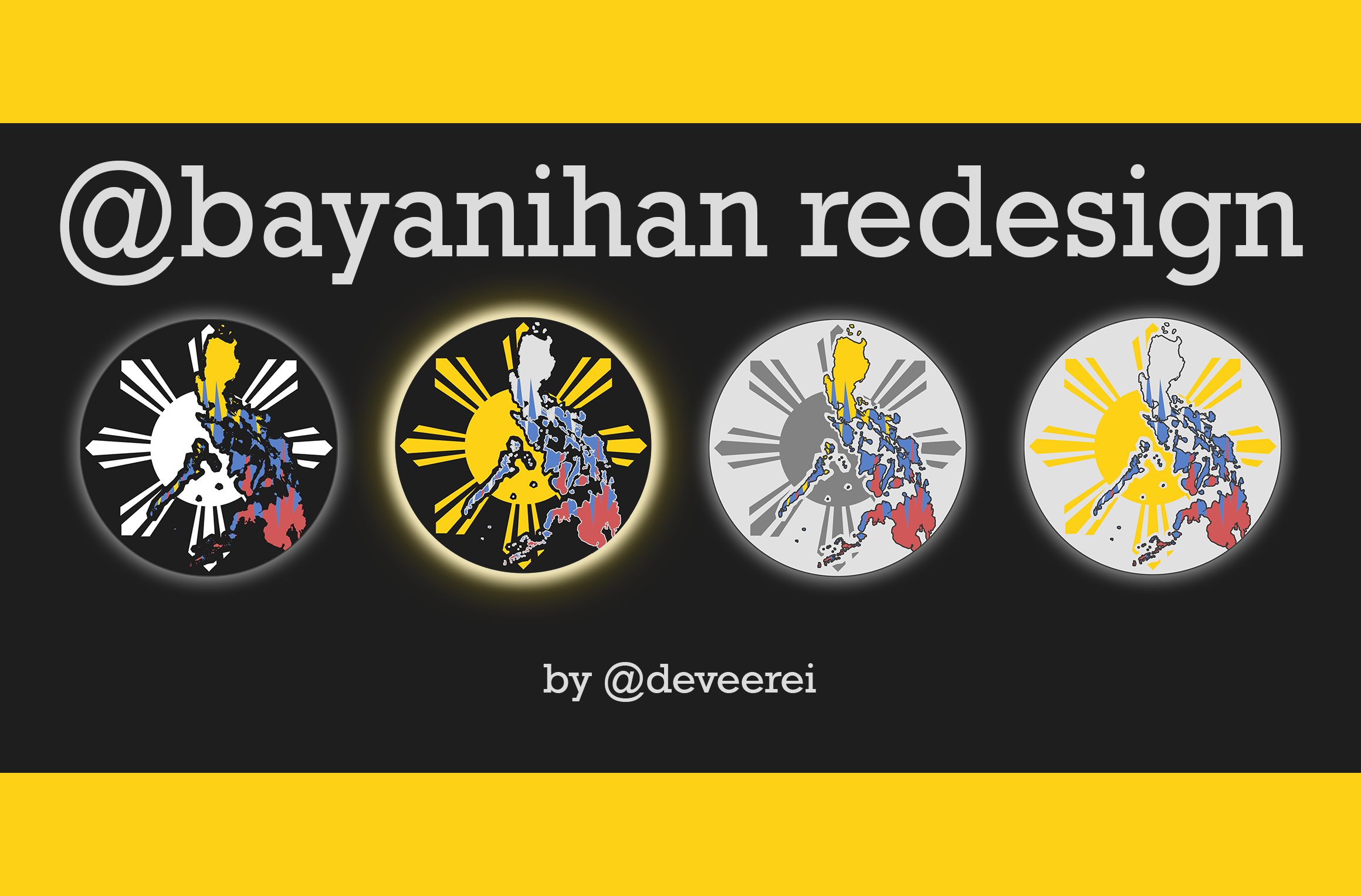
It has been 6 months ago when I made a similar post to do in regards to the first set of @bayanihan graphics (Bayanihan: Banner, Logo, & Announcement.)and I thought it's about time to make a change and do a redesign for the group. You can also check out the 2 previous posts I made to help with this decision:
With the help of the curators in @bayanihan, we've decided to pick our new logo and base all our graphics on it. So far, only banners and logos have been made. Next stop will be the curators' cover images and footers.
If you don't know what @bayanihan is check out the announcement here: View The Bayanihan Announcement.
Making the Logo
Here's a compiled GIF image explaining how I made the logo. Basically, it's in a circle and I added the Sun on it. Then I placed the map over it along with some outlines with the same color as the circle container.
![]()
This design contains 3 different elements that explains @bayanihan's role and goal:
- The Sun
- The Map
- Colors used

This logo uses the official Sun of our flag (Philippine flag). The sun in our flag actually symbolizes and important part of our freedom's history. The rays on it are from the 8 provinces who spearheaded the revolution against the Spaniards (we were a colony of Spain for 300 years).
In the center of the white triangle is an eight-rayed golden sun symbolizing unity, freedom, people's democracy, & sovereignty. Each ray represents a province with significant involvement in the 1896 Philippine Revolution against Spain; these provinces are Manila, Bulacan, Cavite, Pampanga, Bataan, Laguna, Batangas, & Nueva Ecija (some sources specify other provinces as alternatives to some of these. - Wiki
These rays stands for the spirit of @bayanihan, which is essentially: Working Together for the good.
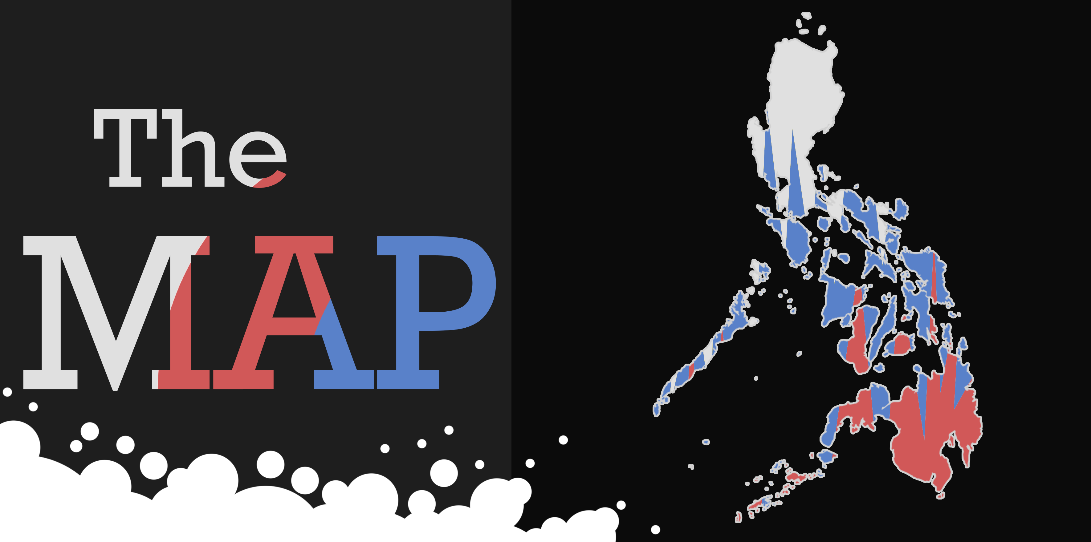
@bayanihan is a curation group based in the Philippines and aims to support and curate great Filipino authors and such. The map is used to symbolize nationalism and dedication towards this work. To a greater extent, using our homeland's map does not include authors based elsewhere since we know that wherever you may be, a Filipino's heart remains here.
The colors are simple, we used variants of white, red, yellow, & blue (which are the colors of our flag). We used muted variants for aesthetic purposes since the official colors of our flags are really bright. The colors on the map where filled in like spikes or zigzags to not denote regional differences. For example: we could have made Luzon white, Visayas blue and Mindanao red but that would look wrong and may imply negative things.
Final Logo
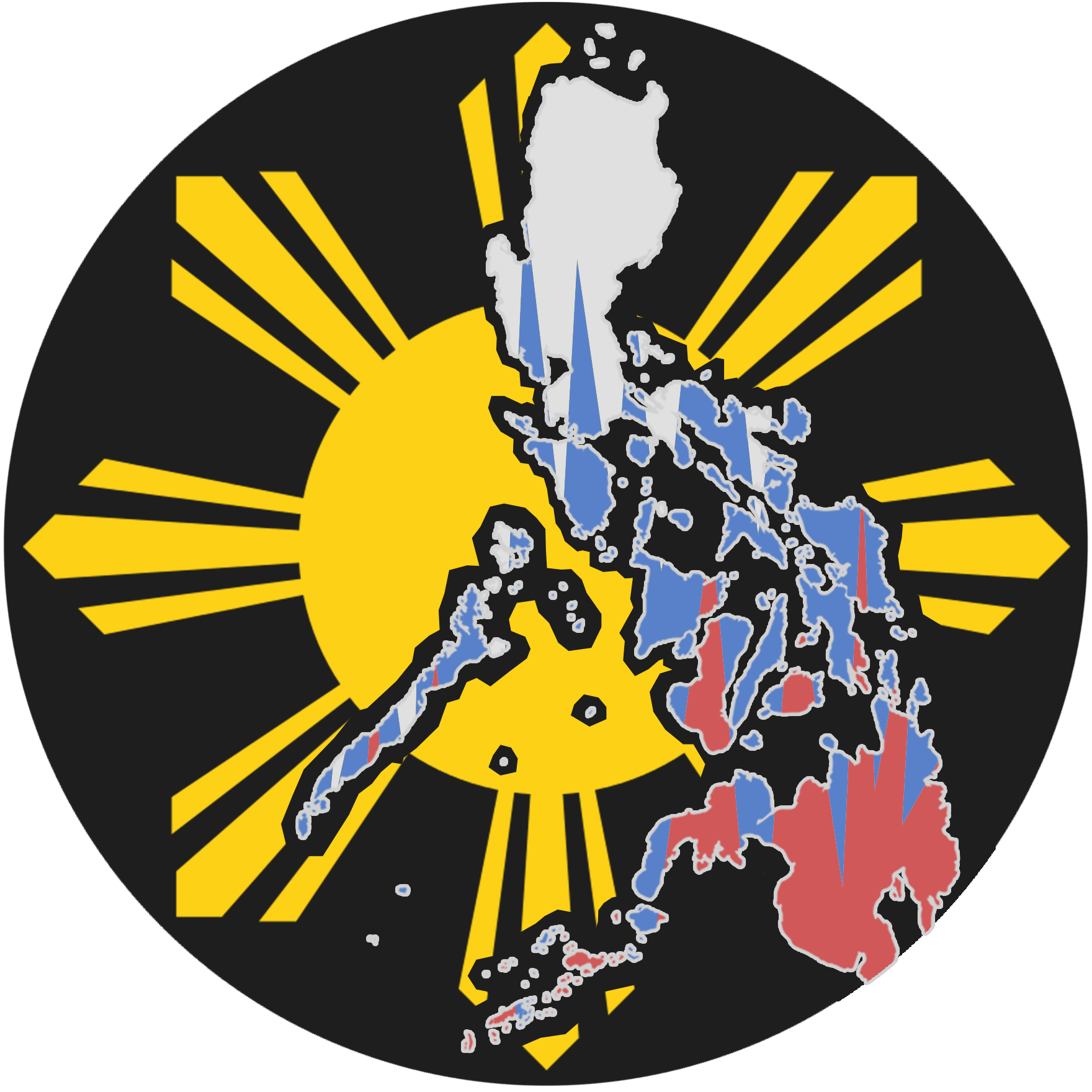
This is the final version of the logo to be officially used for and by @bayanihan and it's curators and mentors. This image is protected by copyrighted and should not be used without official permission and voting by the curators of @bayanihan.

)
)
)