Designing a Logo for Hi - Health Infographics
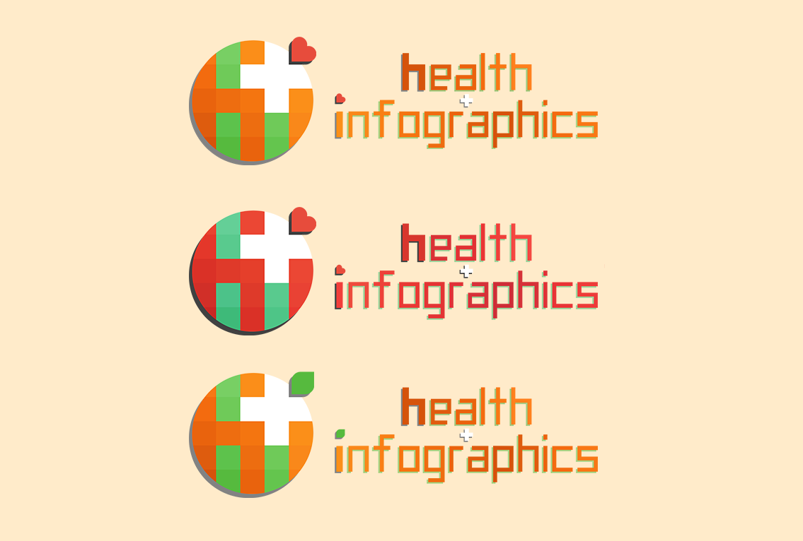
These 3 designs above are my final presentation towards my boss. The top one would most likely be the option we'll go to. If no other idea comes up.
The bottom one's design is based on the Orange fruit. Mainly because the company's color is orange and fruits are also healthy.
The middle one was made just so we can add in a heart in the design. Had to change all the colors to red and cyan to mix it up a bit.
The top one is just a fusion of the other two.
What do you guys think of the design?
)
)
)