NEW STEEMIT LOGO & LOOK! Spotted in Steemitstage.com!
Something New?
I'm sure I wasn't the only one who saw this change. Is this the new logo they're taking about?
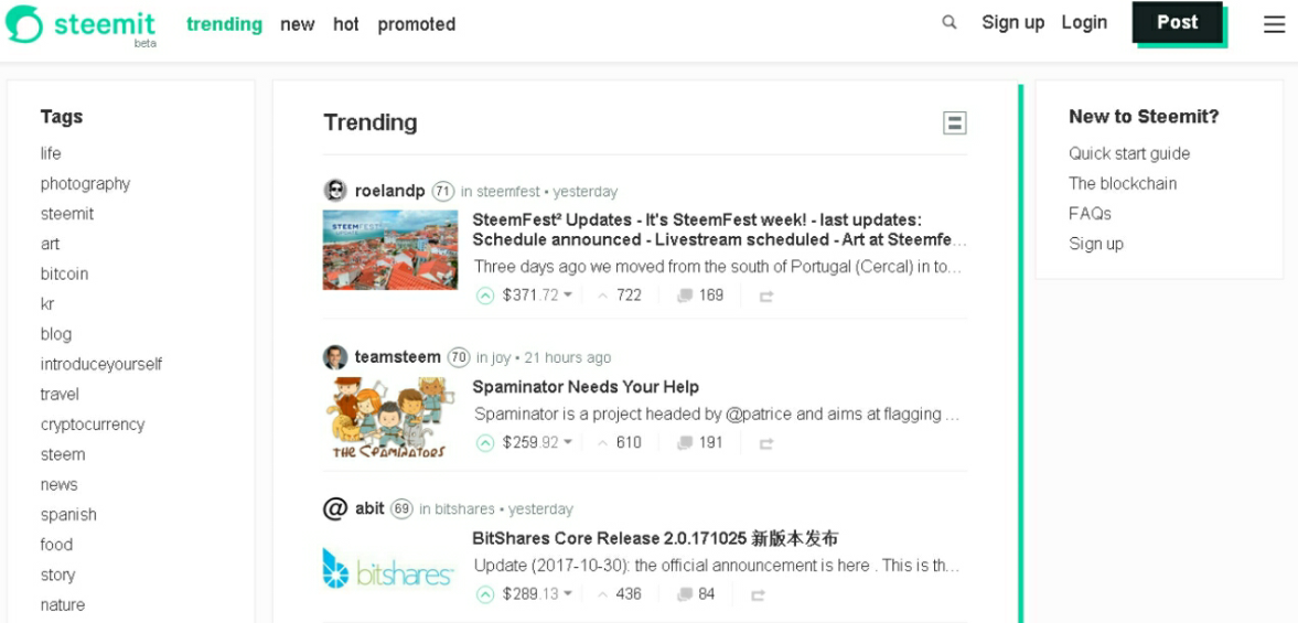
I've provided screen captures of the main feed and my blog.
What do you think? Are you going to be a fan of the new colors and logo?

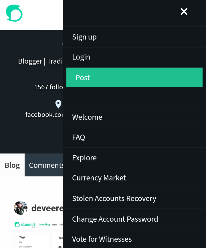
Mobile View
Now, here's what it looks like on mobile view, the main feed's ad:

A look at my blog. My cover images doesn't work:

Accents and color changes are noticeable in this menu:
My Thoughts
I like the new colors in it. Especially the bluer accents on the dark parts of the website. The accent color (is that green blue?) looks okay but I prefer the last one (like Busy.org's blue). Somehow the website looks a darker Steemiz.com copy.
The transitions are great especially on the buttons.
The logo is something I'd pass on. I prefer the old one. This new logo makes the website look like a chat app, in my opinion. I don't know, maybe they have a greay explanation for choosing that design?
If their explanation about the changes are convincing enough then so be it, let's use this one. If not, I may move over to the new Busy.org ( @busy.org doing great on https://nd.busy.org, I like it, and your twin @utopian-io looks good too).
Maraming Salamat!
Thank you so much!

)
)
)


